The New York Islanders won’t be a half-a-century old for antother few years, but it doesn’t mean we can’t start thinking about how they should celebrate that anniversary campaign.
By that time, the franchise will be in its second season in their new home at Belmont Park. And maybe Mathew Barzal is starting to get his names in the ranks of the greatest players of all time to ever wear an Islander uniform.
The latter is more of a dream. Then again, it would be interesting to see what Barzal would look like wearing the classic look from the Isles’ dynasty years where they ruled the league and won four straight Stanley Cups and dominating. Or maybe picture him in the Halloween-orange jerseys the team wore from 2003 to 2006. The Reebok Edge threads the team donned during most of their rebuild at the end of the 2000s and into the early 2010s.
NHL teams always go big when they reach anniversary years. Just go back and look at the Montreal Canadiens and Toronto Maple Leafs and how they celebrated their 100th year in the league. Even this past season the Vancouver Canucks executed bringing back their retro looks to celebrate while also evolving their current getups.
Like those select clubs, and many others who have celebrated anniversary seasons, the Isles also have a ton of uniforms to choose from to pay homage to their history.
And here’s five of them that should be brought back when that season gets underway:
5. The Navy Blues (1999-2007)

After the franchise finally rid itself of the heinous fisherman logo and the wave jerseys with the original logo, they moved back to a more traditional look. For eight seasons, this set was fantastic and paid homage to the dynasty teams of yesteryear with the four-strip patch on the right shoulder. Sleek. Clean. Unflashy. The Isles organization had a rebirth in the years they donned this outfit, making the postseason four times.
4. The Road White Reebok Edge (2007-2010)

Following the Islanders’ last playoff appearance in ’06-’07, it felt like it was time for a change both on and off the ice. That meant the uniforms. And with Reebok now taking over as the official provider for the NHL, they brought in a whole new look for many NHL teams. One was the Isles, and low and behold, we got this underrated ensemble. These jerseys don’t get the respect they deserve, but they were a fan favorite of many who bought them. Yes, there were some lean years in these jerseys for many. But they were the first to be worn by the new wave of talent the organization was beginning to assemble.
3. The Post-Dynasty Blues (1984-1995)

Regarded by many as the greatest look the franchise has ever worn, these jerseys were just aesthetically beautiful in every single fashion. From the striping, to the logo, to the socks, everything just clicked with these duds. The Isles also continued to have good success in wearing these threads, making the playoffs seven out of 11 years. Lets not also forget the number of memorable moments that occurred while this was the team’s look. Can anyone say Easter Epic or David Volek?
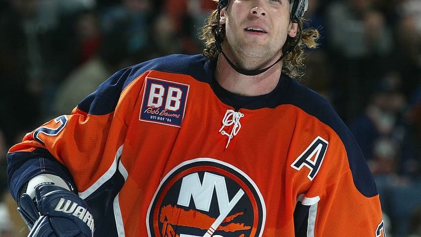
2) Orange Crush (2002-2007)
/cdn.vox-cdn.com/uploads/chorus_image/image/59890193/72838215.jpg.0.jpg)
The Islanders had never had a third jersey in the history of the franchise up until 2002. Then out of nowhere, in November they debuted these bad boys (I know because I was there that night and my Dad bought me a Michael Peca one after the game). Some will still say it was a knock off of the Dallas Stars uniform set from back then, but they were still one of the coolest and most unique jerseys the team ever produced. Even to this day, walk around Nassau Coliseum at any time before or during a game, and you’ll find at least two or three fans rocking these sweaters.
1) The OG’s (1972-73)
/cdn.vox-cdn.com/uploads/chorus_image/image/66667425/642062888.jpg.0.jpg)
The first uniform debuted in the inaugural season of the franchise. These magnificent threads from top to bottom made the Islanders look like a major league organization, despite being an embarrassment on the ice. The orange numbers just pop from the moment you first lay eyes on them. These jerseys laid the foundation for the dynasty to come several years later. The organization has brought this look back only twice since they stopped wearing it after that first year — Retro Night in 2007 and the final regular-season game at the Coliseum (before they moved back last season) in April 2015. Celebrating 50 years since the franchise was born, this would be the perfect blend of nostalgia and allow a new generation of Islander fans to relive a bit of a missing piece of the team’s fabled history.
More about:New York Islanders