After weeks of discussion, the Islanders finally revealed their “Reverse Retro†jerseys yesterday as a part of a league-wide program to be used for this upcoming season.
The video, which showed clips of all 31 jerseys being modeled, saw the Isles newest threads as a navy blue base with orange and white stripping.
Built on a Dynasty.
Introducing the #Isles adidas #ReverseRetro jersey. Hitting the ice in 2021. pic.twitter.com/ZhDGxbagwu
— New York Islanders (@NYIslanders) November 16, 2020
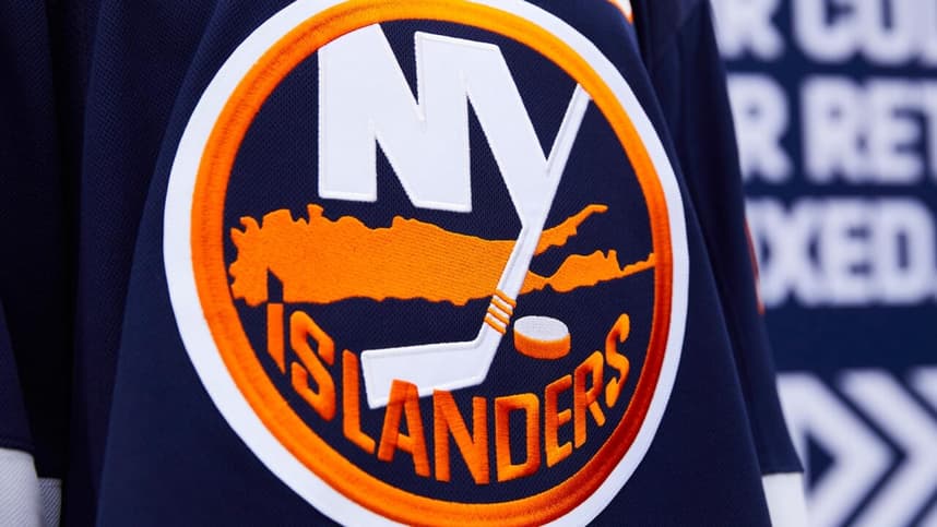
“Built on a Dynasty†was the tagline for the inspiration behind the look as the jersey features the striping pattern from the years of when the franchise won four straight Stanley Cups and has the “80†insignia on the inside collar.
The team didn’t provide any further description about the jersey or it’s background while many other clubs did.
Let me preface this by saying we all knew a navy blue jersey was coming, but there were some expectations there would have been a little more creativity involved. But with someone like Lou Lamoriello running the show around here, fun isn’t at the top of his priorities, much to the chagrin of the fans.
So now that the uniform has officially been unveiled, I have some thoughts on what it is and what could have been.
Here’s a few of them:
1. It’s a very clean look.
It shouldn’t come as a surprise that these Isles jerseys looks sharp. The organization already sports one of the best uniforms in the league. So seeing a navy blue version of what is essentially tweaked versions of their current setup, only adds to another solid look to the mix. The white numbers with the orange outline also compliment the navy blue well.
2. There’s nothing good or bad about them.
The jersey definitely lacks creativity. Very little about it catches your eye, but that can also be seen as a positive in a way. Some teams definitely went in the direction of the former and were unsuccessful. Hard to fault the Isles for going the route they did when they’ve worn mostly the same look since their inception outside of the Fisherman/wave era. The conservative style is what suits the team and that goes hand-in-hand with exactly how their general manager is.

3. It should have had the four stripes patch on the shoulder.
This would have at least added a pleasing aspect to the jersey. The Islanders had the four stripes on the shoulder to represent the dynasty for the entirety of the time they donned navy blue from 1998-2010. And yes while the four stripes appear on the stick of the “NY†part of the logo, the smart move would have been to have it as a shoulder patch. The whole point of the jersey is to honor the look that built the franchise to a dynasty, so why not show it as one of the primary features? A big miss.
4. An orange base would have been welcome.
Nothing wrong with going with the navy, but the team going with an orange jersey would have at least felt different. The Isles did wear an orange alternate — Halloween orange — in the mid-2000s and it was a big hit among the fans and players. Orange is also the only other color in the Islanders’ scheme that could have been selected for an initiative like this one.
5. The marketing felt a bit off.
The whole reverse retro moniker didn’t really apply to the Isles here. Marketing the look as an ode to the 1980 club didn’t hit here. And this doesn’t even have to do with the shoulder patch as I mentioned above, but even the stripes didn’t do the job here.
6. The Fisherman stays put.
The Islanders not bringing the Fisherman back might be a disappointment to a lot of the fans both of the team and around the league, but there was no chance of it coming into play here. Once the Adidas preview last week showed the number 80, that basically should have ended the conversation about a possible return of the mid-‘90s logo. Also, just go read ESPN’s Alan Hahn’s Twitter timeline from last night, and you’ll figure out why the organization steered clear of the decision.
7. They could have done way worse.
Amid the backlash the team received for going with a bland reveal, things could have gone even more south if they followed some of the fellow clubs direction. I mean the Red Wings jersey? Talk about awful. Maple Leafs? Nearly or just as boring. Tampa Bay? Uninspiring. Winnipeg? I have no idea what that is.
Look, the Isles were never going to get crazy like the Ducks, Coyotes and Avalanche did — Colorado knocked it out of the park by the way — but they seriously could have done a lot worse with their final product.
For the three or four times they’ll wear it, it’s not a bad look, not an awesome look, but a plain look.
What are your thoughts on the Islanders’ reverse retros?
More about:New York Islanders